William Caslon
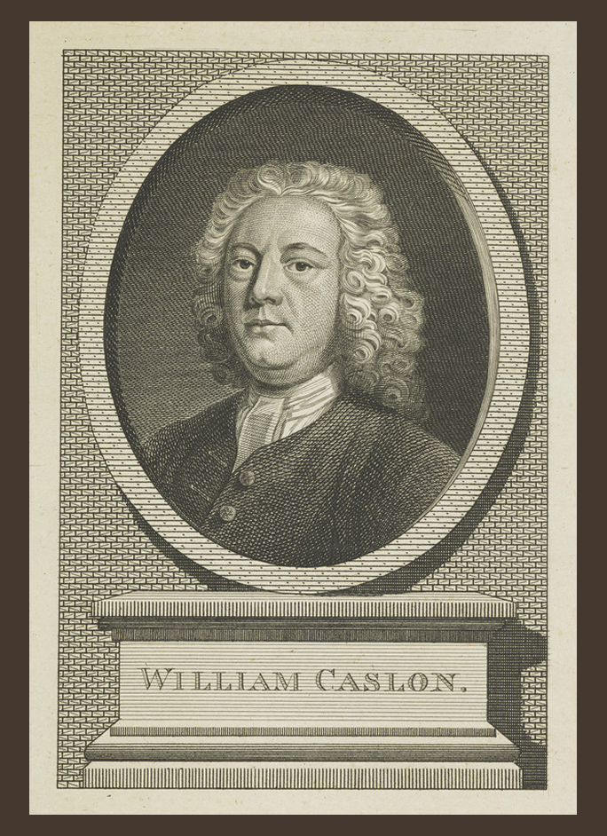
Born in Britain in 1692, William Caslon was Britain’s first domestic typographer (TypeRoom).
His namesake typeface, Caslon, became the most common and popular
metal type in Britain when it came out in the 1700’s.
His Old-Style Serif typeface would serve as a basis for future English typefaces to come.
Caslon was trained as an engraver in Birmingham, and by 1716 while running his business as a gun lock engraver and bookbinder’s tool cutter, he met the printing profession largely through the encouragement of one William Bowyer (TypeRoom).
Up until Caslon, there was no
domestic type foundry in England.
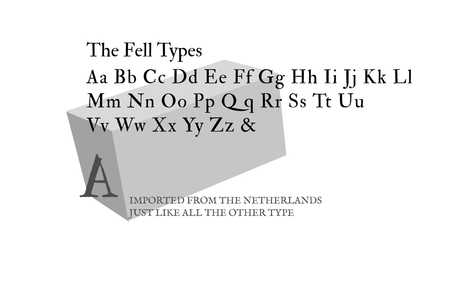
All type had to be imported, mostly from the Netherlands which meant that Dutch designs were the most common and available for use. One example of these foreign types is The Fell Types.
The Fell Types, while being casted in England under the auspice of John Fell, Bishop of Oxford in the late 1600's, were cut and designed in Germany and consisted of a collection of French, Dutch, and German typefaces (McNeil).
This typeface was the closest thing to an English-made type available in Caslon's time, with the designs being more indicative of the Dutch Baroque style so popular in the Netherlands (TypeFace).
It didn't help that these types, The Fell Types especially, had numerous technical errors (McNeil).
Caslon as a typeface, both the original and future versions based heavily on his work such as Adobe Caslon, show the hallmarks of an Old-Style Serif typeface.
The stresses of letterforms with ellipses such as “O” and “Q” are mildly diagonal, emulating the handwritten letterforms common in Caslon’s time. Certain letterforms such as uppercase Roman “Q”
have in them calligraphic elements, with these calligraphic elements being more present and noticeable in the tail of uppercase Italic “Q”, the wavy calligraphic form of the arm in uppercase Italic “J” and the Gadzook in the Italic ligature “ct”. Even more noticeably, uppercase Italic “Q”’s letterform consists of a swirly style stroke that leads into a swash with a teardrop terminal.
Other elements to note are the calligraphic, swirly Italic “?”, the single-storey lowercase Italic “a” as compared to the lowercase Roman “a”, the cursive style connected arm on lowercase Italic “k”, and the cursive style serifs on certain Italic letterforms such as “m”, “n”, etc. Overall the counters on Caslon’s typeface are decently wide, with this and the only mild stroke contrast pairing together to make a readable, easy-on-the-eyes typeface.
A - “A” cupped cap
B - Triangle head-serif on some letterforms
C - Imperfect circular tittle
D - Double-storey “g” with teardrop ear
E - Slightly diagonal stress
F - Bracketed serifs on feet of most letterforms
G - Teardrop terminals on many letterforms
H - Mild contrast between thinnest and thickest strokes
I - “Q” having long, calligraphic-style tail
“When in doubt, use Caslon.”
Caslon’s work was based on the available Dutch designs of his day. However, his work also made letterforms stouter and upright, with only mildly diagonal stresses on letterforms, mild but not extreme contrast between the thinnest and thickest strokes, and more. This resulted in a typeface that was readable, but more importantly a typeface that English printers didn’t have to import, which lead to the typeface becoming extremely popular throughout the English and American printing world (McNeil 77). So much so, that there was seldom a book printed in the mid-to-late-1700’s that didn’t use the Caslon typeface, and the phrase “When in doubt, use Caslon” became a popular phrase in the printing field (TypeRoom).
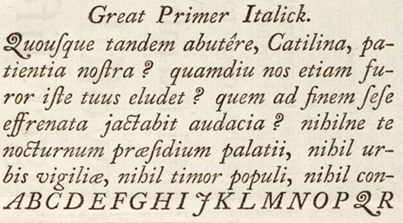
A – Kerning between “Q” and “uo” letterforms tightened to account for long tail
B – Small caps caption
C – Usage of a space between a letter and punctuation inconsistent (likely to keep the line measure consistent)
D – Double-character ligatures used when visually optimal
E – Triple-character ligatures used when visually optimal
F – Estimated em size based on capital “M” letterform
G – Estimated leading, approximately just under one em
This composition is from Caslon’s specimen sheet, set by William Caslon himself and containing examples of all the type he designed. The title of the paragraph is in small caps, with the first letters of the two words “English Roman” being in caps, and the rest of the letters in small caps. The tracking of the centre-aligned title line is a lot wider and more open than the rest of the composition, likely to further differentiate the title line from the rest of the text. The Latin main body text has no beginning indent, likely because the title line text doesn’t extend enough to warrant it. The kerning between the “Q” and “uo” letters in the Latin word “Quousque” are tightened so that the long calligraphic tail of the “Q” is tucked under the “uo” letters. There is no rag on the block of text, with the usage of space between letters and punctuation inconsistent to maintain a spacing akin to justified text. Ligatures are used throughout the text when optimal for visual quality.
Caslon’s work ushered in an era of English typography defined by a more unique style of letterform construction that didn’t piggyback off the work on the European continent, as well as ushering in the age of Transitional Serif typefaces.
His most significant contribution to the field of typography was making his typeface in the first place. As his work was England’s first domestic type (McNeil 77), his design choices of something that balanced the calligraphic elements of Old-Style and the more vertical stresses that would influence the later Transitional typefaces set the foundations for further typefaces to come. A notable example of a Transitional typeface that was based on Caslon’s work is John Baskerville’s Baskerville, and by proxy Didot and Bodoni (McNeil 81; “British Typography - Just Our Type”). His work let English and by proxy American typographers create their own style of type, allowing for these typographers to design works without having to rely on whatever styles were popular on the European continent. One commentator noted that Caslon “introduced into his fonts a quality of interest, a variety of design, and a delicacy of modelling, which few Dutch types possessed (MyFonts).”
Caslon as an Old Style Serif typeface influenced
Baskerville, a Transitional typeface.
Caslon’s design, incorporating both the calligraphic quirks (and technical
errors) of the Dutch designs available to him and a generally sturdier, more solid
foundation of his forms birthed a British style of typography that influenced further
typefaces to come.